- What is FFF345?
- Breaking Down the Color Code: RGB, HSL, and CMYK!
- The Psychology Behind FFF345: What It Evokes!
- Why Use FFF345 in Your Designs?
- Best Practices for Using FFF345 in Web Design
- How FFF345 Enhances Branding and Marketing?
- FFF345 in Fashion and Product Design
- Practical Uses of #FFF345 in Graphic Design
- Complementary Colors for FF345
- Conclusion
- FAQs
- What does FFF345 represent in design?
- What are the RGB values of FFF345?
- How can FFF345 be used in web design?
- Why is yellow associated with positivity?
- What are the complementary colors for FF345?
- Can FF345 be used for branding?
- How does FF345 impact branding and marketing?
- Is FF345 suitable for seasonal campaigns?
Color plays a pivotal role in design, psychology, and branding, and one color that has been making waves in various creative fields is FFF345.
This bright, inviting yellow is often known as Paris Daisy and is gaining traction across industries due to its ability to evoke warmth, positivity, and creativity.
In this article, we will dive deep into the various facets of FFF345, including its color composition, psychological effects, use in design, and practical applications.
What is FFF345?
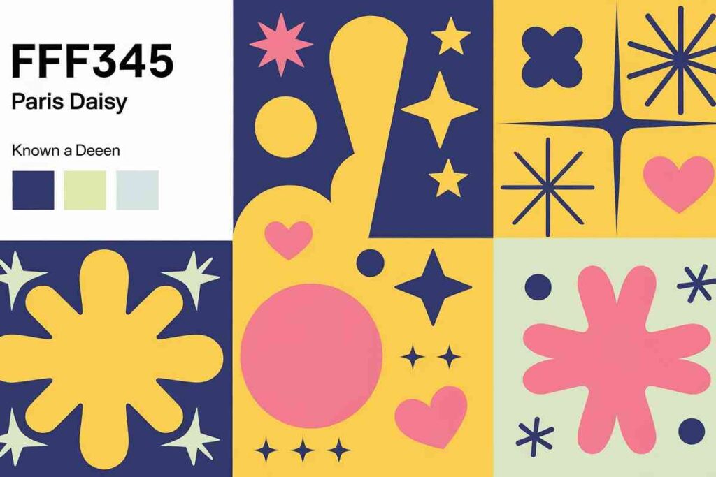
The hex code FFF345 represents a vibrant yellow color with a slight greenish undertone. It is characterized by the following RGB composition:
- Red (255)
- Green (243)
- Blue (69)
This color’s light and lively appearance make it perfect for projects that aim to convey joy, optimism, and warmth.
Breaking Down the Color Code: RGB, HSL, and CMYK!
RGB Composition
- Red: 255
- Green: 243
- Blue: 69
These values indicate that the color is primarily red and green with a modest amount of blue.
This gives it a warm, slightly earthy yellow tone that stands out while still being soft and approachable.
HSL (Hue, Saturation, Lightness)
- Hue: 56.13° (indicating a yellowish hue)
- Saturation: 100% (fully saturated, giving it its bright appearance)
- Lightness: 63.53% (relatively light, contributing to its vibrant feel)
CMYK (Cyan, Magenta, Yellow, Black)
- Cyan: 0%
- Magenta: 5%
- Yellow: 73%
- Black: 0%
The Psychology Behind FFF345: What It Evokes!
The Emotional Impact of Yellow
Yellow is universally associated with happiness, positivity, and energy. FFF345 is no exception it encapsulates these feelings with its warm, cheerful hue.
When used in design, it can evoke a sense of optimism and creativity, making it ideal for brands and designs aimed at uplifting or energizing their audience.
Positive Associations
- Happiness: Yellow is often considered the color of sunshine and cheer.
- Creativity: Yellow is known to stimulate mental processes and inspire creativity.
- Warmth: This color exudes warmth, making it perfect for hospitality and family-friendly brands.
However, like all colors, yellow has its nuanced associations. It can also symbolize caution or warning, which is why it is often used in traffic signs or to grab attention in specific contexts.
Why Use FFF345 in Your Designs?
Eye-Catching and Attention-Grabbing
The brightness of FFF345 ensures that it catches the viewer’s eye. It works exceptionally well in areas where attention needs to be drawn immediately, such as call-to-action buttons, important notifications, or promotional banners.
The high visibility of this color helps it stand out in both digital and physical designs.
Invokes Positive Emotions
For brands that want to connect with their audience on an emotional level, FF345 is an excellent choice.
The color’s ability to evoke feelings of happiness, joy, and optimism makes it a great fit for family-friendly, lifestyle, or wellness brands.
Versatility in Design
Despite being bold and vibrant, FF345 is surprisingly versatile. It pairs well with both neutral and vibrant colors, making it adaptable across various design styles.
Whether you’re working with minimalist designs, modern web aesthetics, or even vintage retro looks, this color can fit seamlessly into a variety of contexts.
Best Practices for Using FFF345 in Web Design
Pairing with Contrasting Colors
In web design, contrast is crucial for ensuring readability and user engagement. FFF345 works well with dark blue, black, or deep gray, which allow the yellow to pop without overwhelming the viewer.
Pairing FF345 with such colors creates an appealing and balanced visual experience.
Use in Accent and Highlight Elements
Instead of using FF345 as the primary background color (which may overwhelm users), consider using it as an accent.
It is perfect for call-to-action buttons, highlights, and icons. Its high visibility makes it great for directing user attention to essential elements like sign-up forms, promotions, or key information.
Avoid Overuse in Large Text Blocks
While FF345 is bold and exciting, overuse can cause eye strain. Use this color sparingly in text-heavy areas to maintain readability.
Instead, consider employing it for headings, subheadings, or key phrases that need to stand out.
How FFF345 Enhances Branding and Marketing?
Appealing to a Younger Audience
The energetic and playful nature of FFF345 makes it an excellent choice for brands targeting younger demographics.
Its cheerful vibe is often used in products or services related to entertainment, gaming, or kids’ brands.
Establishing a Friendly Brand Identity
Brands that prioritize warmth, friendliness, and approachability can benefit from using FF345 in their logos and marketing materials. Its vibrant tone is perfect for conveying an inviting brand personality.
Ideal for Seasonal Campaigns
Bright yellow hues like FF345 are perfect for seasonal campaigns, particularly during spring and summer when the color is associated with sunshine and vitality.
If you are running a limited-time promotion or seasonal marketing, FF345 can evoke the right mood for the occasion.
FFF345 in Fashion and Product Design
A Bold Statement in Clothing and Accessories
In fashion, FF345 is often used in clothing and accessories to make a bold statement.
Its vibrant and energetic nature adds a fresh and playful vibe to collections. Designers may use it in seasonal collections to evoke warmth and cheerfulness.
Product Packaging and Branding
Products that emphasize health, wellness, or family-oriented attributes often use FF345 in their packaging to convey a sense of joy and trustworthiness. It’s particularly popular in products like food, beverages, cosmetics, and toys.
Practical Uses of #FFF345 in Graphic Design
Print Media Design
In print media such as brochures, posters, or business cards, #FFF345 can be used to highlight key information.
Its bright, eye-catching nature ensures that important details like headings, promotional offers, or calls to action stand out.
Logo Design
Logos that aim to convey a fun, friendly, or creative personality often incorporate FF345 to set the right tone.
The color can be used as a background or accent in logos to enhance brand recognition.
Complementary Colors for FF345

When using FF345 in your designs, it’s essential to pair it with the right complementary colors to maintain balance and visual harmony. Here are some of the best choices:
- #4551FF (Deep Blue): A strong contrast to the yellow, perfect for creating visual interest.
- #FF45F3 (Vibrant Pink): Adds a playful and modern touch when paired with yellow.
- #AEFF45 (Light Green): A lighter, refreshing complement to yellow that enhances the overall vibe.
Conclusion
FFF345 is a dynamic and engaging color that brings energy, warmth, and positivity to any design.
Its versatility across various platforms web design, branding, fashion, and product packaging makes it a go-to choice for designers who want to create engaging, emotionally impactful experiences.
By understanding its psychological impact, color composition, and best practices for use, you can effectively integrate FF345 into your projects to enhance user engagement and convey your brand’s unique message.
Whether you’re designing a website, creating marketing materials, or developing a product line, FF345 has the potential to make a bold statement that resonates with your audience.
So, embrace the power of this cheerful, vibrant color and use it to add a touch of warmth and optimism to your creative work.
FAQs
What does FFF345 represent in design?
FFF345, known as Paris Daisy, is a vibrant yellow hue that symbolizes warmth, creativity, and positivity, making it ideal for uplifting designs.
What are the RGB values of FFF345?
The RGB values for FFF345 are 255 (red), 243 (green), and 69 (blue), creating a bright, yellowish shade.
How can FFF345 be used in web design?
FFF345 works well as an accent color for call-to-action buttons, highlights, and key elements on websites, adding energy without overwhelming the design.
Why is yellow associated with positivity?
Yellow, including FFF345, is linked to sunshine and happiness, promoting feelings of optimism and creativity, which are perfect for engaging audiences.
What are the complementary colors for FF345?
Complementary colors for FF345 include deep blue (#4551FF), vibrant pink (#FF45F3), and light green (#AEFF45), offering strong contrasts and harmony.
Can FF345 be used for branding?
Yes, FF345 is a great choice for brands that want to convey warmth, friendliness, and creativity, making it especially popular in lifestyle and wellness branding.
How does FF345 impact branding and marketing?
This color’s energetic and cheerful nature can appeal to a younger demographic and help establish a friendly, inviting brand identity.
Is FF345 suitable for seasonal campaigns?
Absolutely. Its bright, sunny appearance makes it a perfect choice for spring and summer promotions, evoking warmth and vitality in seasonal marketing.
